Follow up to the bond yield scenario during deflationary busts

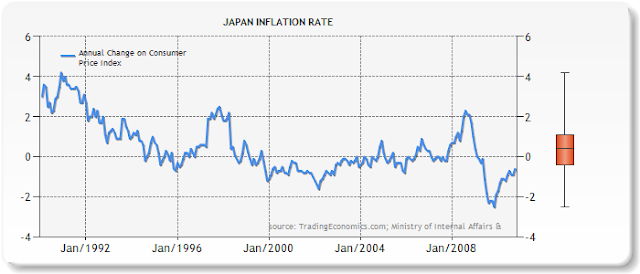
Given the drastic changes in bond yields of late, I thought I would update the charts I produced a few years ago showing bond yields during three major deflationary busts. It's almost as if we had gone full-circle over the last two years. The present yield (as of end of August, 2011) on the 10 year US Treasury is lower than what it was back in 2008! You may want to read the original post I wrote to get more details about the following charts and the source of the data (the original post also has a few more charts I didn't update). American Bond Yields in the 2000's The following chart shows the bond yield of the 10 year US Treasury, up to the end of August of 2011.

.png)
.png)
